


Overview
The project focused on converting an existing desktop-based recruitment system into a mobile-friendly platform. This allowed recruiters to access candidate information and job requisitions on-the-go, ensuring constant connectivity and efficiency.
My Role
Sole UX Designer
Deliverables
Wireframes, process flow, prototype, final designs
Tools
Figma, Jira
the problem
Recruiters often face the challenge of needing immediate access to candidate and job requisition data when away from their desks. The lack of a mobile-friendly interface leads to delays and inefficiencies in the recruitment process.
MY Approach
User Centric Design Adaptation
While simultaneously designing the desktop and mobile versions of the recruiter app, this case study zeroes in on the mobile design process, which presented unique technical challenges. My journey involved two primary hurdles:
NOTABLE CHALLENGES
C.1
Displaying Large Data Tables
Deciding how to effectively display candidate and requisition tables containing thousands of entries. Options considered were an accordion-style layout versus a fixed left-side navigation with scrollable tables.
C.2
Dashboard Information Architecture
Determining the most relevant information for recruiters on the dashboard, balancing the necessity and usability on both desktop and mobile platforms.
I collaborated with the UX Researcher to conduct interviews with 13 recruiters and recruiting assistants.
Key Findings:
-
Candidate Drop-offs: We identified significant drop-off points in the recruitment process, particularly during assessment phases, incomplete applications, and post-interview stages for non-selected yet suitable candidates.
-
Need for Solutions: Recruiters and sourcers emphasized the necessity for a solution, either mobile or desktop, that addresses these drop-off points with effective notifications or insights, allowing quick recruiter intervention to re-engage candidates.
-
Mobile Preferences: A unanimous preference for a high-level overview on mobile platforms, focusing on essential tasks like managing upcoming interviews and promptly acting on applications to prevent losing potential candidates.
User Personas
In the research phase, I made significant strides in understanding the unique workflows and needs of my target users. By developing distinct user personas for sourcers/coordinators and recruiters, I tailored my design approach to address their specific requirements. This was complemented by the creation of a process flow diagram, which was instrumental in outlining the steps in the recruitment process.


Process Flow
This diagram highlighted key areas prone to candidate drop-offs, such as the assessment phase, incomplete applications, and the post-interview stage. These insights were critical in shaping the direction of my wireframe development, especially in ensuring that the mobile experience was streamlined for the essential tasks recruiters face daily.


These insights were critical in shaping the direction of our wireframe development, especially in ensuring that the mobile experience was streamlined for the essential tasks recruiters face daily.
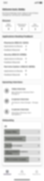
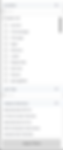
I began developing wireframes for the mobile app, concentrating on the main dashboard to effectively display key information. I created three distinct dashboard variations, each designed to present essential data effectively.
V1
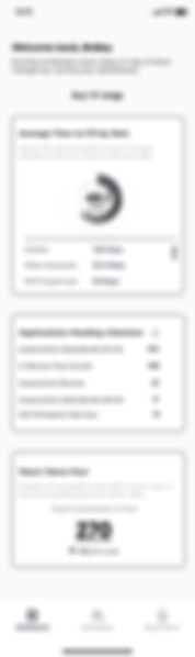
V2
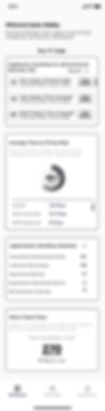
V3
Understanding Recruiter and Sourcer Needs
The UX researcher employed multivariate testing techniques to showcase my wireframe designs to a fresh batch of recruiters and sourcers.
Outcome:
Participants appreciated the general layout but suggested that certain data points were superfluous for the mobile version.
Interactive Feeback:
Unprompted, they actively selected elements they found valuable and identified those they deemed unnecessary for mobile use.
"I need the key information. It's about quick access and efficiency."
"It's great to have the data. Every time I'm in a meeting, I bring in the stats."
"I honestly don't see myself using this feature that often."
"This feature, the onboarding feels a bit redundant."
Feedback on Wireframes
-
Version 1:
-
Eliminate Onboarding Widget: While informative, participants felt the onboarding statistics didn’t necessitate a dedicated widget on mobile and were more suitable for metrics reporting.
-
Valued Widgets: Emphasized the usefulness of 'Applications Needing Feedback' and 'Upcoming Interviews'.
-
-
Version 2:
-
Remove Average Time to Fill a Role: Considered more relevant for the desktop version, as mobile usage was geared towards tasks requiring immediate attention.
-
-
Version 3:
-
Similar to Version 2, with a preference for removing the 'Average Time to Fill a Role' widget.
-
Valuable Insights for Final Designs
-
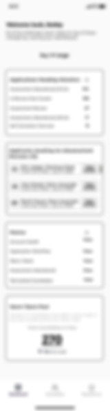
Key Features Desired: Participants showed a strong preference for widgets like 'Upcoming Interviews', 'Applications Needing Attention', and access to a 'Warm Talent Pool' to quickly mobilize candidates for new opportunities, along with an easy way to access reports.
-
Information Architecture Assistance: This feedback was instrumental in refining the information architecture, ensuring that the final design aligned with the users' most pressing needs and preferences for the mobile experience.
Handling Extensive Candidate and Requisition Data
For the candidate list and requisition pages, I faced a significant challenge: presenting extensive data in a mobile-friendly table view. After thorough research, I considered both fixed scroll and accordion styles for data tables and developed two design versions to address this.
1. Fixed Scroll Design
This layout anchored the candidate name or requisition number to the left, allowing horizontal scrolling to view the rest of the table's data. I chose this design believing it effectively presented critical information while enhancing discoverability.
Unlike the accordion model, this approach allowed more data to be visible upfront, aligning with feedback from recruiters who preferred immediate access to key facts.
Fixed Scroll

2. Accordion Model
This alternative design featured a dropdown mechanism, revealing additional details upon tapping. However, this model only showcased the candidate’s name initially in the list, with other vital information remaining hidden until interaction.
Ultimately, I opted for the fixed scroll design due to its ability to display more information at first glance. This decision was made to meet the recruiters’ need for quickly surfacing important details, although it was based more on intuition than testing due to time constraints.
To validate this choice, further user testing is scheduled.
Accordion


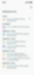
Finalized Wireframes
After completing a few more wireframes, including the candidate page, the resulting designs, as seen in the finalized wireframes, emphasize ease of use and rapid access to information, tailored to the mobile recruiting environment.
Login

Dashboard
Candidates Page

Requisitions Page

Candidate Profile: Resume

Overview

Notes Page

Specific Job

Filter Drop Down Options
Job Description Popup Modal

The solution
Empowering Recruiters with Mobile Agility
The final designs center exclusively on the mobile experience, crafted to empower recruiters with the ability to efficiently perform their tasks anywhere, anytime.


Streamlined Navigation
The mobile interface is designed for quick and intuitive access to essential recruitment functions, making it ideal for fast-paced, on-the-go scenarios.

Condensed Data Presentation
With a focus on displaying vast amounts of candidate and job requisition data in a clear, concise manner, the mobile design includes innovative solutions like fixed scroll tables and interactive tiles for candidate information.


Customized Dashboard
The dashboard prioritizes immediate actions and critical updates, such as upcoming interviews and application statuses, ensuring recruiters can rapidly respond to dynamic recruitment needs.

Results and Impact
Recruiters have responded favorably to the mobile design, particularly appreciating its efficiency and the ease of accessing and managing candidate information on the move.
anticipated improvements
IM.1
Increased Recruiter Productivity
By minimizing the need for desktop reliance, recruiters can stay productive and connected to their workflow, regardless of their location.
im.2
Faster Candidate Engagement
The mobile interface allows for quicker candidate interactions, potentially speeding up the hiring process and improving candidate experience.
im.3
Data Accessibility
With essential data and functionalities readily accessible, recruiters can make more informed, timely decisions.
the conclusion
This project underscores the significance of mobile technology in recruitment, offering recruiters a powerful tool to manage their responsibilities efficiently while on the move. By focusing on the nuances of mobile interaction and information presentation, the final design not only enhances recruiter productivity but also aligns with the dynamic and flexible nature of modern work.
