

Overview
In this project, our team designed an exploration tool for HR professionals to understand the complexities of the IT job market. As a UX designer among three designers and two visuals artists, my focus was on crafting wireframes for the tool's additional view page, aligning with existing design constraints and project parameters
My Role
UX Designer in a team of 5
Deliverables
Wireframes
Tools
Figma, Jira, Axon
the problem
The central problem addressed by the IT Career Force Graph project was the lack of a comprehensive tool for HR professionals to understand and navigate the dynamic movements within the IT job market. The existing systems failed to provide clear, actionable insights into potential career paths and job transitions, leaving HR users without the necessary resources to make informed decisions about talent acquisition and career development. The team established these key goals for the project:
g.1
Visualizing Complex Data
To develop a tool that effectively visualizes the vast amounts of industry data, making it easily understandable for HR professionals.
g.2
Interactive User Experience
To create an interactive platform that allows HR users to explore various aspects of the IT job market, including company-specific roles, industry trends, and market comparisons.
g.3
Informative Decision Making
To provide HR professionals with a resource that aids in making well-informed decisions regarding talent management and career path development within their organizations.
the process
Wireframe Development Within Constraints
My wireframes had to align with existing designs, considering time and technical constraints. This required a balance between creativity and adherence to set parameters.
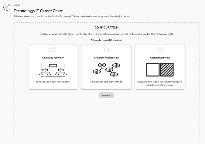
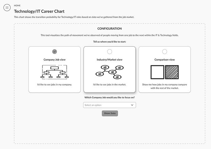
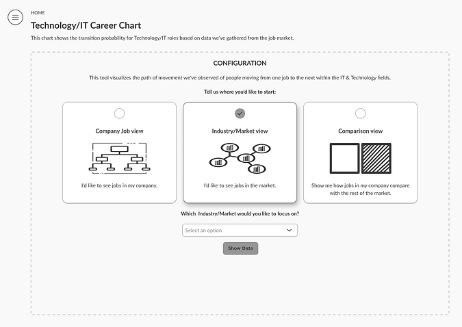
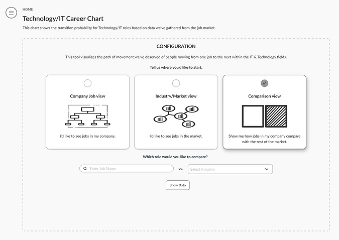
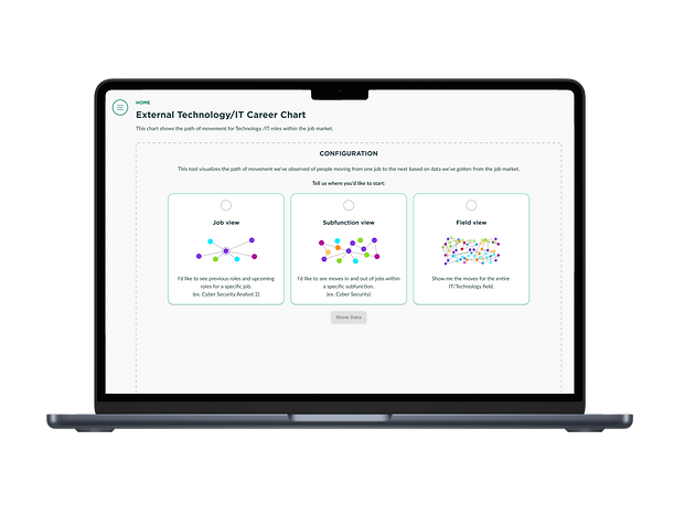
Additional Views Landing Page
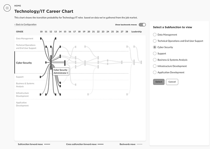
The first set of wireframes presents the landing page where users can choose among three options: Company Job View, Industry/Market View, and Comparison View. Each selection leads to a different dropdown option for further exploration.
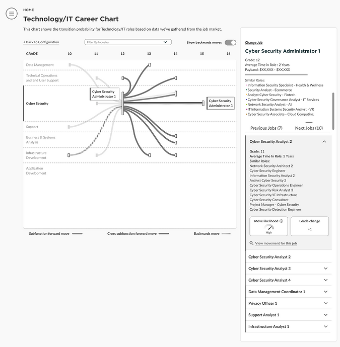
Data Visualization Exploration
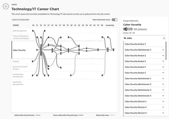
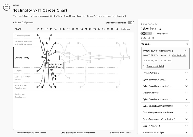
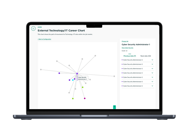
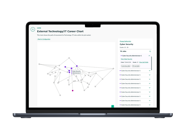
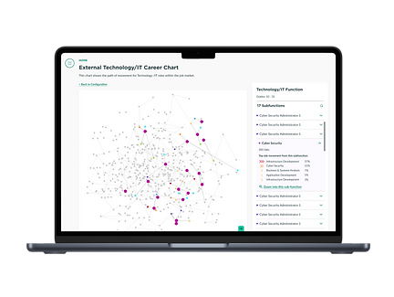
Upon selecting 'Show Data', users are directed to the data visualization page. Here, they can interact with the visual elements, tapping on bars to drill down into detailed data related to their chosen sub-function.
1. Company Job View Selected

2. Industry/Marketplace View Selected
3. Comparison View Selected

Given the complexity of designing for a large data set and visualizing career movements, transitions, and goals, the following additional challenges were encountered:
NOTABLE CHALLENGES
C.1
Balancing Data Density with Clarity
Handling and visualizing the large volumes of data from external sources in a way that is user-friendly and informative.
C.2
Differentiating Stretch vs. Realistic Goals
Clearly distinguishing between aspirational (stretch) career goals and more realistic, achievable paths within the visualizations.
C.3
Representing Dynamic Transitions
Effectively illustrating the dynamic nature of career transitions and movements in a visually intuitive manner.
These goals and challenges paint a picture of the project's scope and the specific areas where focused efforts were necessary to achieve success in creating the IT Career Force Graph
the solution
After refining my wireframes based on feedback, I handed them over to the visual designer to further develop the final visualizations. While the wireframes I developed were the foundation for the final designs, notable alterations were made during the visual design phase.
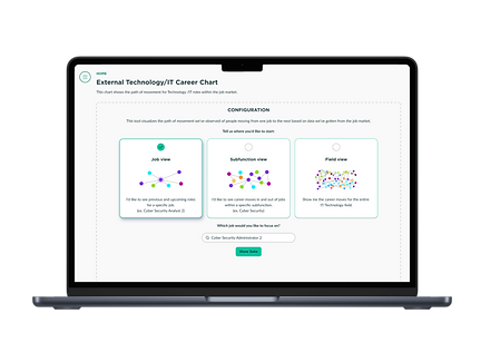
The data team, addressing technical constraints, refined the user experience by focusing on specific views: Job View, Sub Function View, and Field View.
Additionally, in a move to enhance practicality and visual alignment with real-world navigation cues, circular locators were adopted in place of the original rectangular design.
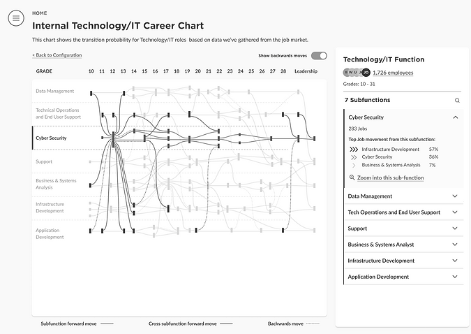
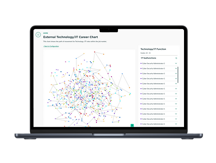
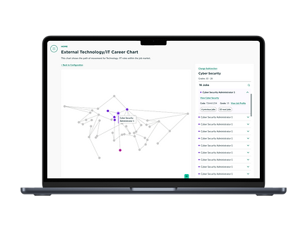
The Final Design
Showcasing the culmination of our project, these designs reflect the adaptations made during the visual design phase, including the focused views and the shift to circular locators.

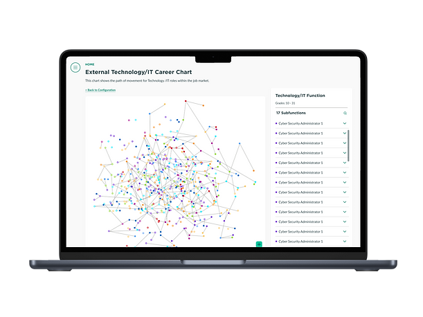

All Screens
.png)

.png)
Conclusion
This project underscored the value of effective teamwork, especially in a cross functional setting. Working alongside data specialists, visual designers, and other UX designers taught me the importance of clear communication, mutual understanding of roles, and the benefits of diverse perspectives moving towards a common goal. This experience highlighted the necessity of being flexible and agile, particularly when project scope shifts, requiring rapid adaptation in design strategy.
